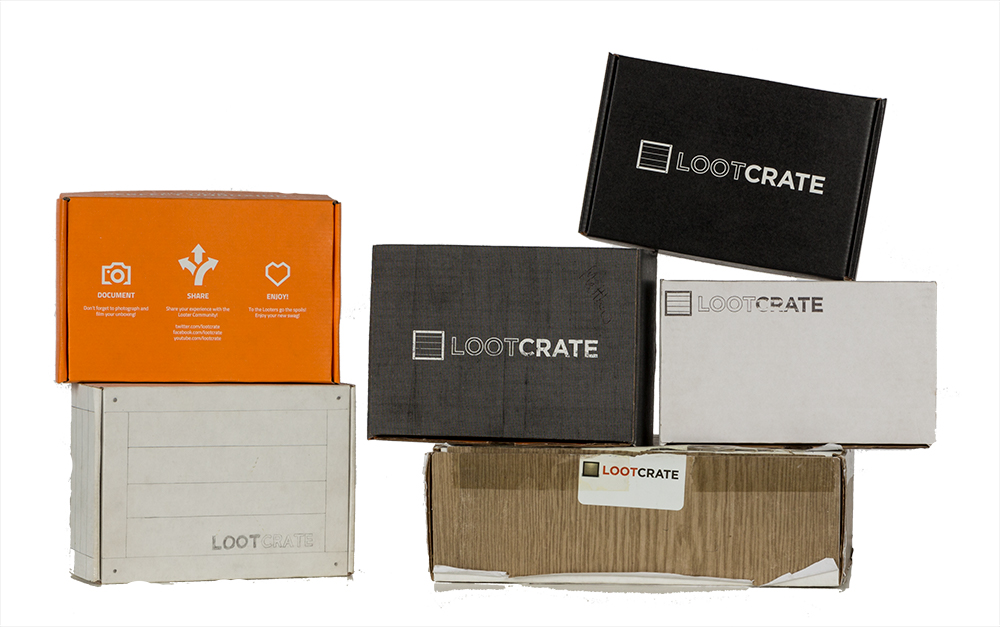
To say a lot has changed in the years since the creation of Loot Crate is an understatement. When we shipped our first crate in 2012, we had just one crate option instead of the many we have today, shipped in a simple and unassuming white box with a hand stamp of our logo. We’ve certainly upped our game since those days, so as we lead up to our fifth anniversary later this year, let’s take a fun look back at how we got here:
LOOTY! 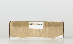
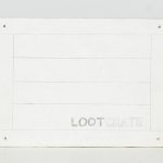
This was the original concept crate, put together the weekend Loot Crate was born. Created to show off the concept of the vision of Loot Crate, this crate, lovingly referred to by all as “Looty”, was a box with wood grain paper attached to the side and a sticker of our very first logo to seal it. Looty is a one of a kind and has never been shipped, but we keep him safe for all to see here at Loot HQ.
THE “O.G.” 
The original Loot Crate. This was the box used for the first “Founders” crate, and included member cards made of wood, a $20 gift card for Gentle Giant, caffeinated jerky, Avengers cologne, Pwn caffeinated gum, and other goodies. We continued with this style of crate until January 2013.
WHOO! PRINTED CRATES!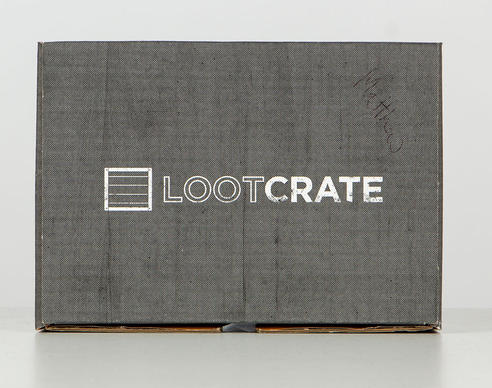
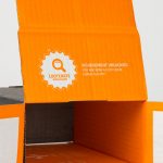
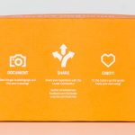
In February 2013, we debuted our first printed crate, much to the delight of our Looters! This one had a crisper looking version of our logo and a printed black wood grain texture. The inside was orange with our “Document / Share / Enjoy!” design that set off a trend amongst subscription crates. This crate also contained an easter egg under one of the flaps for those sleuthy enough to unfold the left inner wall of the box!
NEW HOTNESS!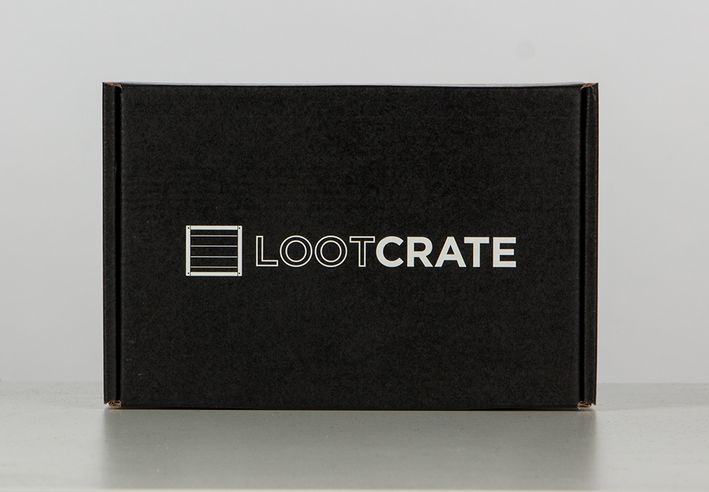
As our subscriber base began to grow, so did the amount of boxes we ordered, which increases likelihood of the occasional misprint or mistake. During our hefty quality assurance process crates go through before being shipped, I noticed one of the boxes had somehow become oversaturated with black ink during the printing process. Instead of sending it back or recycling it, I kept it as an example of what our box could look like with a darker black and how much the increased contrast of deep black made our white logo pop more. When we outgrew our box manufacturer, we had an opportunity to make improvements and adjustments to the crate. After testing out many designs and prototypes, that ‘misprint’ inspired the final crate look that most people are familiar with today: Jet Black with our White logo. Other improvements included tougher material for shipping, as well as better fluting, which is just a fancy term in the world of boxes for the material inside cardboard and it’s spacing, which controls how much you can see lines and impressions on the box.
BOXES ARE FUN!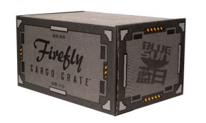
While the black and white design is still the gold standard for most crates today, we always find fun and creative ways to make the box itself a fun part of the unboxing process. This can be seen from everything from our January 2014 LAUNCH crate which had a launchpad on the bottom, to the modern themed interiors of the crates that can be transformed into many things, including backdrops and displays for your loot! Additionally, some of the most fun we have with crate design is the cool crates we get to do with our partners, like the Firefly Cargo Crate, WWE Slam Crate, Marvel Gear & Goods and more!
So, what’s next? Well, in the next few months, we’ll be taking the crate and… uh, uh-oh. A pair of armed Loot guards has surrounded me and threatened to take my Loot away if I reveal that info. While I decide whether I’m going to out-wit them on page 67, or try to out run them on page 84, check out the gallery below for more awesome crate pics!
- “Achievement Unlocked!” Easter Egg hidden inside wall of first printed crate
- A Mockup of a potential Loot Crate design revision, circa 2013.
- First printed crate, folded inside out.
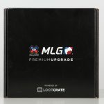
- The first crate we did with a partner, The X-Games / MLG crate.
- LOOTY! The first concept Loot Crate.
- Very first Loot Crate.
- First crate made of printed cardboard.
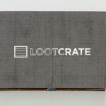
- The Standard, Modern Loot Crate.
